This is an awesome looking artistic papercut design from bittystarr's shop:
http://www.etsy.com/view_listing.php?listing_id=9892800

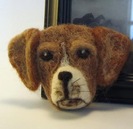
This is a really neat looking felted Beagle pin from PitBullLadyDesign's shop:
http://www.etsy.com/view_listing.php?listing_id=9174246
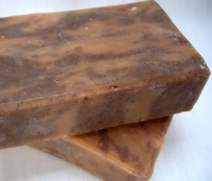
Here is an awesome bar of soap from nordeasoaperie's shop:
http://www.etsy.com/view_listing.php?listing_id=9212970
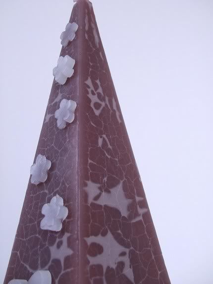
This is a cool looking pyramid candle from the craftinator's shop:
http://www.etsy.com/view_listing.php?listing_id=9804295
And here is a very stylish purse from sheilascrafts' shop:
http://www.etsy.com/view_listing.php?listing_id=7652576
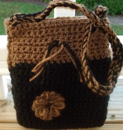
See! I told you brown was an awesome color!!
Now then...for those of you that read my post yesterday, I promised to talk about graphing to enlarge or reduce an image when drawing. For those of you who already know all there is about graphing and grids, be patient...not everyone does ;)
You will need the following:
ruler longer than your drawing surface, or a really good straight edge to go with the ruler
soft lead pencil with a sharp point - I use a good old 2b drawing pencil
white eraser - these erase well, and leave no colored marks behind like pink or other colored pencils do
Step 1:
Decide the finished size of your drawing. Will the subject fill the entire page? If the answer is yes, lucky you....skip to Step 2
If the answer is No, then decide on the placement of your main subject. You don't have to grid the entire drawing surface, just the area where you are placing it. What about the other elements of your drawing? Is your main subject going to be floating on the page? (Don't get me wrong, I love minimalist drawings...but perhaps a small patch of grass, or tree branch...something like that...should go in as well?) Are your secondary elements proportional on the reference material you are using to that of your main subject? If they are, GREAT...this will be a breeze. If not, that's okay too, because this really isn't that hard to do.
Step 2:
Decide how big or small all of your elements should be to make a great composition.
To Enlarge from the original, I like to go in increments that are easily multiplied. I use 1/4 to 1/2 inch grids on the original, and scale up to 1/2 or 1 inch on the drawing, depending on what the size is that I need. You can do more or less if necessary.
To Reduce from the original, once again I like to do it the easiest way possible for me. I use 1/2 to 1 inch grids on the original, and scale down to 1/2 or 1/4 inch on the drawing surface. You should use whichever size grid is easiest for you. I have a proportion wheel, but never use it :)
Step 3:
Making the grid on the drawing surface.
Tread lightly. You want to erase these lines later AND colored pencils pick up every dent in your drawing surface, leaving white lines behind if you aren't careful.
Make your grid by marking the intervals at the space you have decided. Do this about every 1/3 of the surface, making sure that you keep the ruler straight. Having the ruler off by 1/16 inch or more will through your grid out of square. Line up the marks with either your ruler or the straight edge and lightly draw the line.
Step 4:
Making the grid on your reference image.
These lines can be dark enough for you to easily see, but not so thick that they hide details. Make your grid just as you did in Step 3.
Step 5:
Now, draw what you see, using the grid as guides. If you start on grid A4 (or however you choose to name your columns and rows) be sure to start in grid A4 on your drawing surface...this saves alot of time erasing...trust me on this ;) I prefer to make a simple outline before laying down color, putting in just enough of the detail to be placeholders.
When you have finished drawing all that you want from the reference, erase the gridlines carefully from your drawing surface.
See how easy that is? Okay...an art projector would be MUCH easier, but who can afford one of those??!
Okay....stay tuned for another exciting installment of 'How to Get Realistic Effects With Colored Pencils Without Losing Your Sanity'


6 comments:
Hi Connie,
What a wonderful idea! The Art of Color...well, if you need black or reds, you can happily browse my shop: artworkbyimelda.etsy.com
I'd love it!
Thanks,
Imelda
What fun! I'm marking your blog as a favorite to visit often!
I'm in your ACETSY group - you're always welcome to browse my shop too!
http://thecreatorspalette.etsy.com
~Melanie
Hi Connie,
What a wonderful grouping of browns! You are right - it is beautiful!
~ Diane Clancy
www.DianeClancy.com/blog
www.YourArtMarketing.com
Connie, this is a great idea! I saw your post on the Etsy for Autism Yahoo board and zipped right over. It looks so nice to have a bunch of stuff in one color grouped together like that. I would love to be included, I guess I had better get some more stuff listed on Etsy, huh? My 7 little items aren't really enough to choose from!
loudlife.etsy.com
Thanks for promoting Etsy artisans, you remind me that I need to do this more, too, on my blog.
Laurie
connie - thank you so much for featuring my papercut...it looks great with the other beautiful browns!! xoxo
OOOH! BROWN! My ABSOLUTE FAVE! Great picks you got here!
Post a Comment